 Two days ago the guys at google released a brand new api. It’s called Google Chart API. and is free for approx. 50.000 requests per day. This should be enough for smaller projects
 ![]() The interface is quite easy: You call URL’s for your desired graphs. Also the Data is passed directly via the URL as parameters. I did not have the time yet to experiment a lot with it but from the first sight it looks very professional and i will give it a try in one of my administration areas. Here is a custom made example where I illustrate the visitors of webdevbros from the past two weeks in a nice graph…
The interface is quite easy: You call URL’s for your desired graphs. Also the Data is passed directly via the URL as parameters. I did not have the time yet to experiment a lot with it but from the first sight it looks very professional and i will give it a try in one of my administration areas. Here is a custom made example where I illustrate the visitors of webdevbros from the past two weeks in a nice graph…
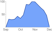
The exmple uses real data from webdevbros for demonstration (yeah i know its not soo much). The next graph shows unique visitors of webdevbros for the last 2 weeks. Both weeks are compared to each other:
Looks amazing, isnt it? It took me 20 minutes to set this thing up. I got the data from google analytics and assembled an URL for the chart API. This is the URL which is needed for the graph above (within an image tag)
- <img src="
- ?chs=350x200
- &chtt=Comparison+of+last+2+weeks|unique+visitors+on+webdevbros.net
- &chts=000000,10
- &chg=16.6,25,1,5
- &chm=R,000000,0,0.66,0.67
- &chxt=x,y
- &chdl=w48|w49
- &chxl=0:|Mon|Tue|Wed|Thu|Fri|Sat|Sun|1:|0|55|110|165|220
- &chd=t:79.1,81.8,81.4,78.6,85.0,33.6,29.1|72.7,79.1,90.9,94.6,80.5,38.2,28.2
- &cht=lc
- &chco=ff0000,0000ff">
(note if you want to test it directly within your browser (without img tag) you need to get rid of the line breaks and replace the & with real ampersands (&). Within an image they must be escaped)
The only tricky thing is that you have to convert your data values manually into percentag values. Which you do easily by dividing each value by your maximum value. In my example the following table demonstrates the calculation best (note: the maximum value is marked bold)
| week 48 | percentage | week 49 | percentage | |
| Mon | 174 | 79.1 | 160 | 72.7 |
| Tue | 180 | 81.8 | 174 | 79.1 |
| Wed | 179 | 81.4 | 200 | 90.9 |
| Thu | 173 | 78.6 | 208 | 94.6 |
| Fri | 187 | 85.0 | 177 | 80.5 |
| Sat | 74 | 33.6 | 84 | 38.2 |
| Sun | 64 | 29.1 | 62 | 28.2 |
Which results in the following parameter for the chart API:
chd=t:79.1,81.8,81.4,78.6,85.0,33.6,29.1|

72.7,79.1,90.9,94.6,80.5,38.2,28.2
The rest is just formatting your graph like labeling your axes, labeling your graph, setting colours, setting grids, choosing your chart type, etc. The API offers the most important customizations. I implemented a grid to outline the values and added some labels and a vertical marker to seperate the weekend from the rest of the week (black line). You see that there is a real whole on weekends ![]()
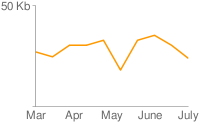
Last but not least here are some other exmples taken from the google chart API …

have fun playing with it…
Hey how cool is that!
I suppose you could cache the chart some how, and then reduce the daily request. That is, of course, if your website generates more thant 50000 requests a day.
I hope I have that problem soon!
good idea with caching … just saving the image on the server.
This is a simple way to show graphs but it’s not supporting none english characters!!
Do u know how can i use UTF-8 parameters in this API !?
Very good thank you and thanks to google
This is not working for me, I see the graphs but my css keeps breaking, any suggestions?